ADIN teaches older adults how to use their devices — inside a safe practice phone where nothing can break. I started it the same month I enrolled in the Google UX Design Professional Certificate, and shipped v38 the month I finished. This is the story of applying formal UX methodology to a real product — and then carrying it onto a second platform.
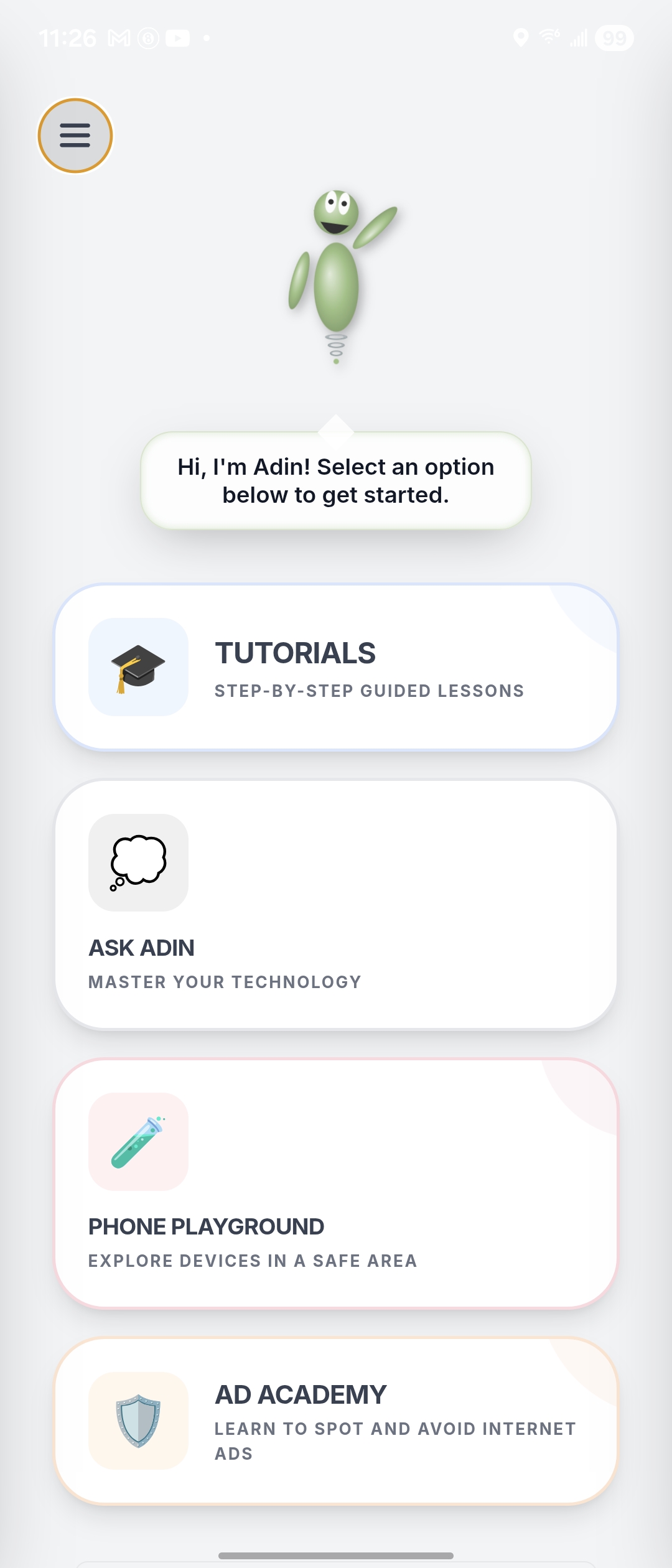
Older adults are routinely handed technology that assumes they already know how to use it. The result is a quiet kind of exclusion — capable people made to feel incapable by interfaces designed for someone else.
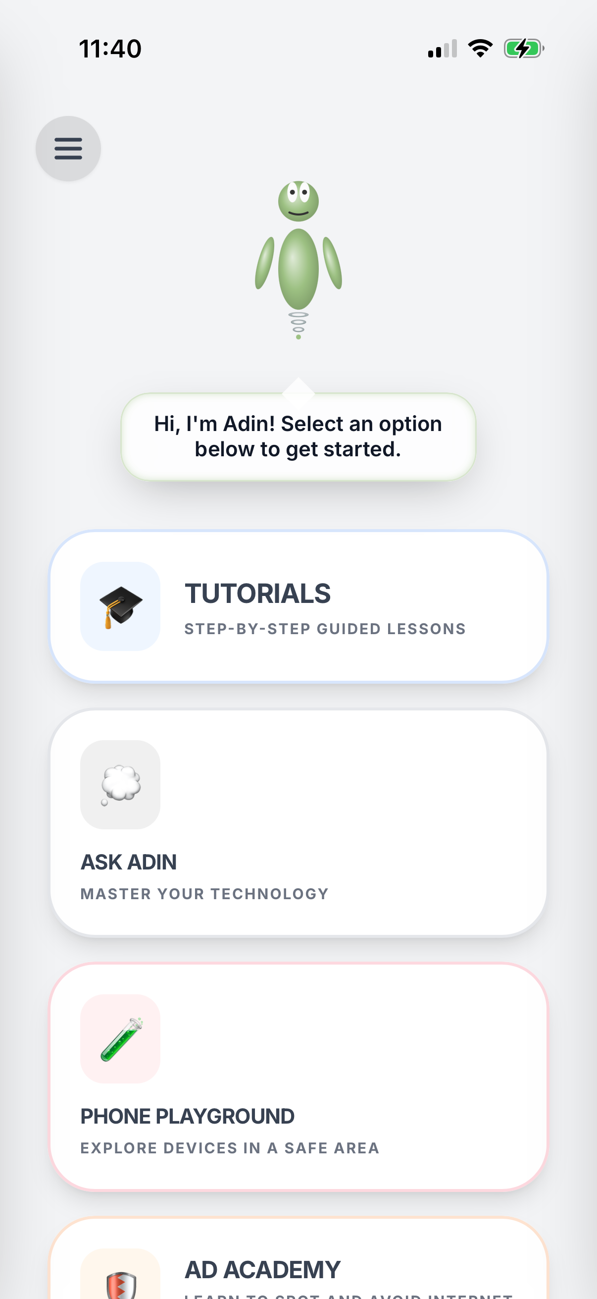
ADIN is a tech-literacy tutor for older adults. Instead of explaining a phone with words, it lets people practice on a simulated phone built into the app — a safe sandbox where tapping the wrong thing has no consequences. A friendly animated helper, ADIN, guides each step. Today it ships 41 tutorials across 10 categories in 7 languages, plus "Ask ADIN," which generates a custom tutorial on the spot — now live on both the App Store and Google Play.
My path into design didn't start in a classroom. I'd been building Android apps for a while as a self-taught developer, and the further I got, the more it became clear that shipping something that works is only half the job — the other half is whether anyone can actually use it. So in early 2025 I enrolled in the Google UX Design Professional Certificate to learn that half properly.
A few weeks in, I started ADIN — deliberately picking a hard audience (older adults, the people most often left behind by software) so the coursework had a real product to test against. Every module fed back into the app: empathy mapping shaped the welcome flow, accessibility principles shaped the icon system, usability testing methodology shaped the two user studies, and iteration discipline shaped the version count.
Started the cert in February 2025. Started ADIN in April. Shipped v38 and completed the certificate in May 2026. ADIN is the proof of work.
Early on, ADIN opened straight into its main screen. The intent was to get people into the tutorials quickly. The effect was the opposite: older adults arrived with no idea what the app was for or where to go. Nothing told them why they were there or what to do first, and a blank moment of confusion is exactly the moment this audience tends to put the phone down.
The app never explained itself. It asked people who were already unsure of technology to figure out a new interface with no guide — the precise experience ADIN exists to prevent. That was the core design failure to solve: not a missing feature, but a missing moment of orientation at the very start.
The cert curriculum was clear on this point: research before design, every time. Before sketching anything new, I studied the everyday Android screens older adults already encounter — the dialer, the messages list, the camera, the browser. The goal wasn't to redesign these screens but to understand the patterns people are already trying to learn, so the practice environment could mirror real devices closely enough to transfer.
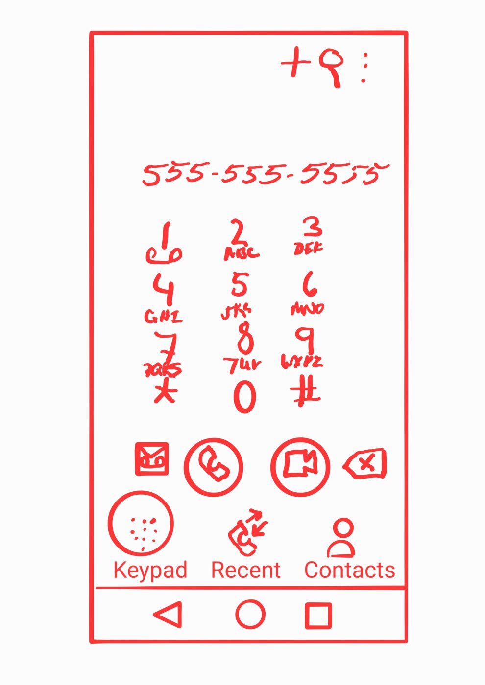
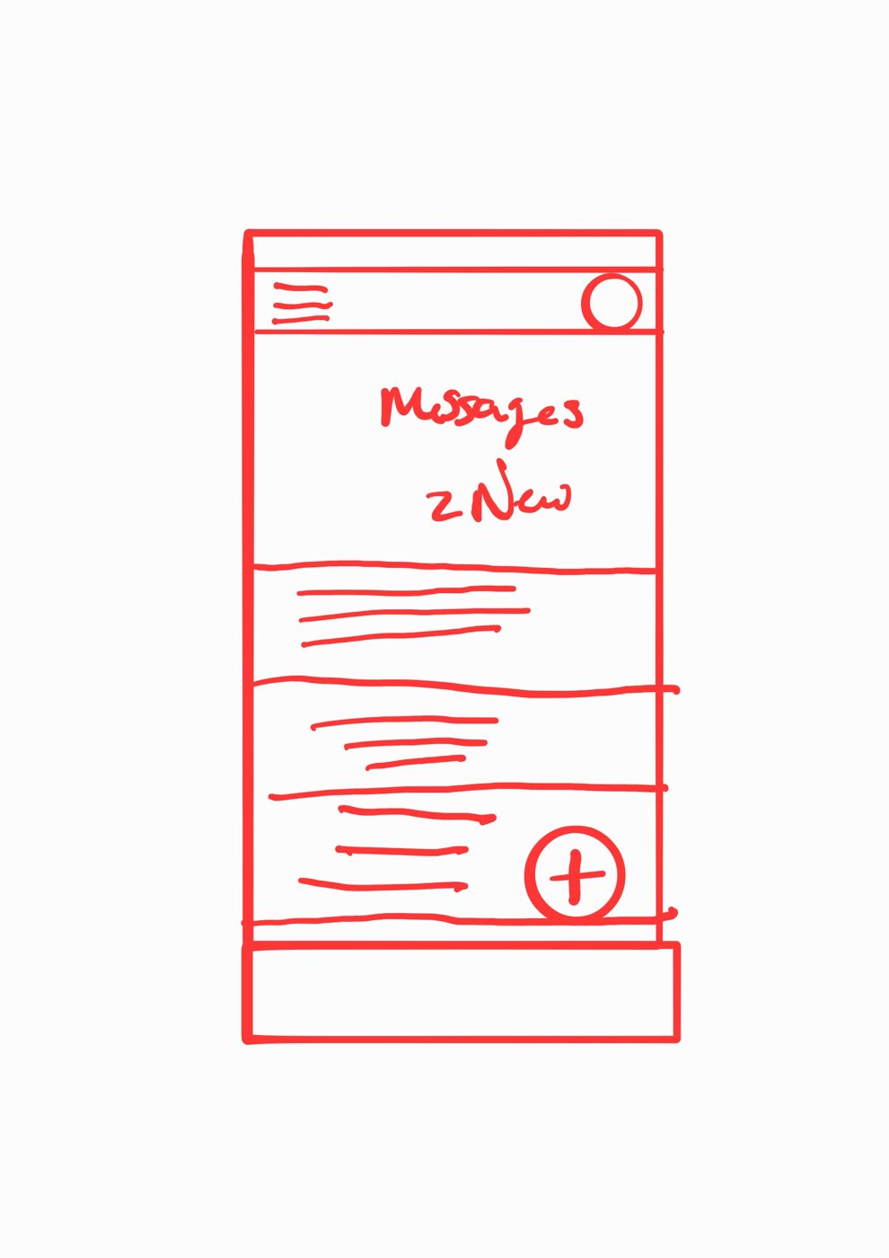
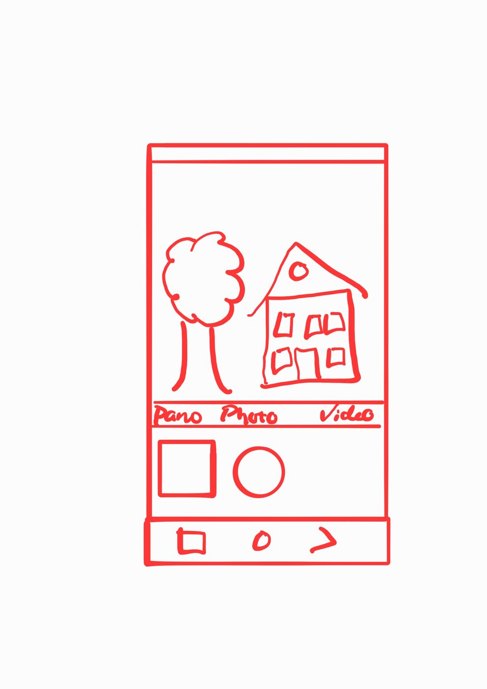
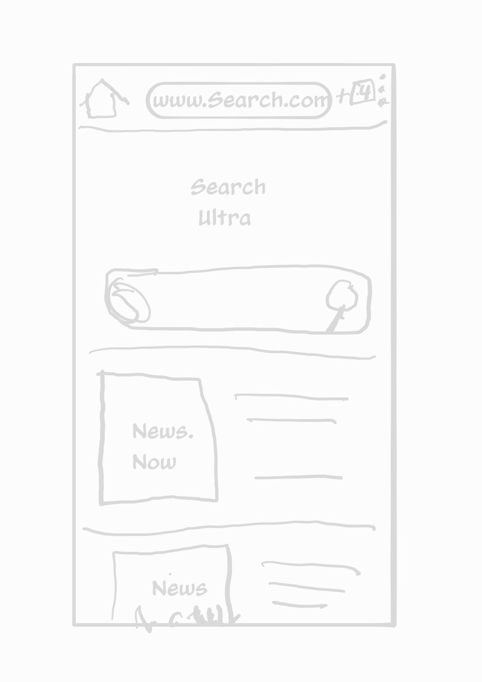
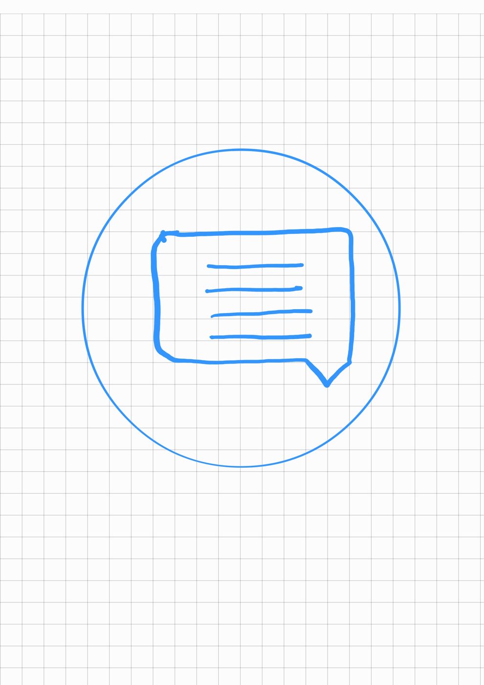
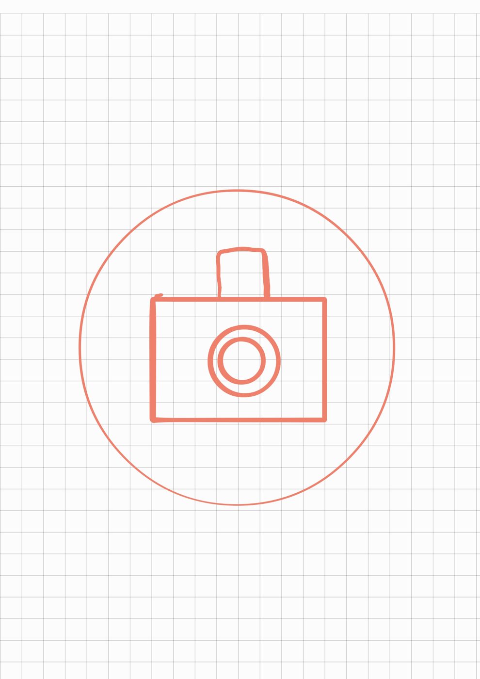
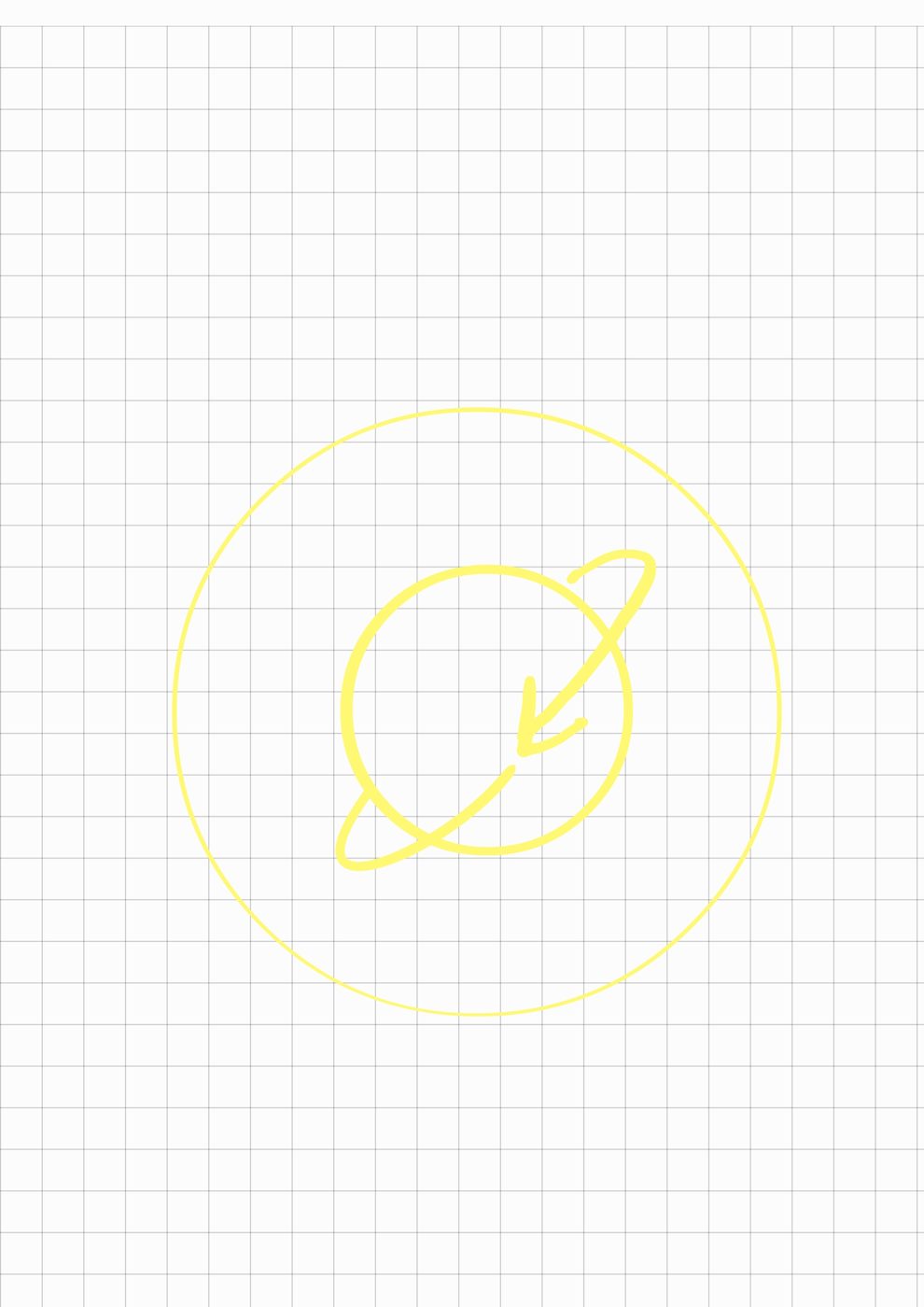
I drew a unified set of circular icons so every app inside the practice phone reads the same way — high-contrast, rounded, and large enough for aging eyes and less precise taps.

The hardest part of teaching gestures is that gestures are invisible. I worked through how ADIN should occupy the screen, where the interaction area sits, and how the character demonstrates a swipe or a tap without getting in the way. I mapped two navigation models — gesture-based and three-button — so tutorials could adapt to whatever device a person owns.
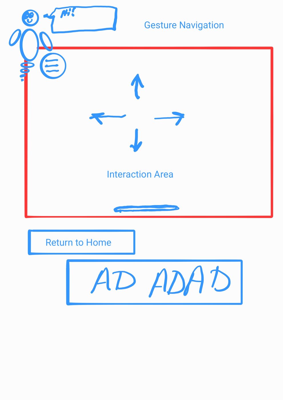
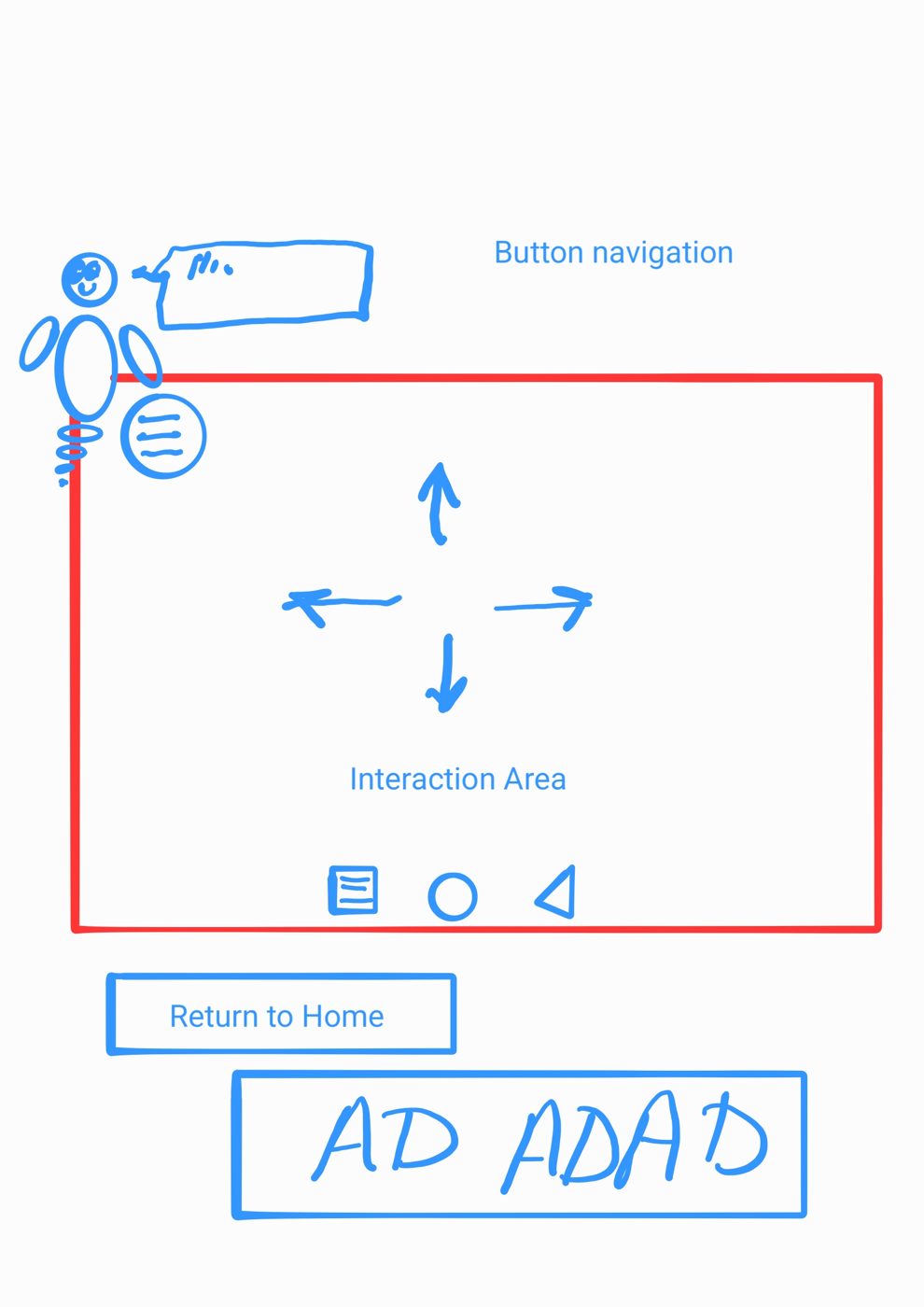
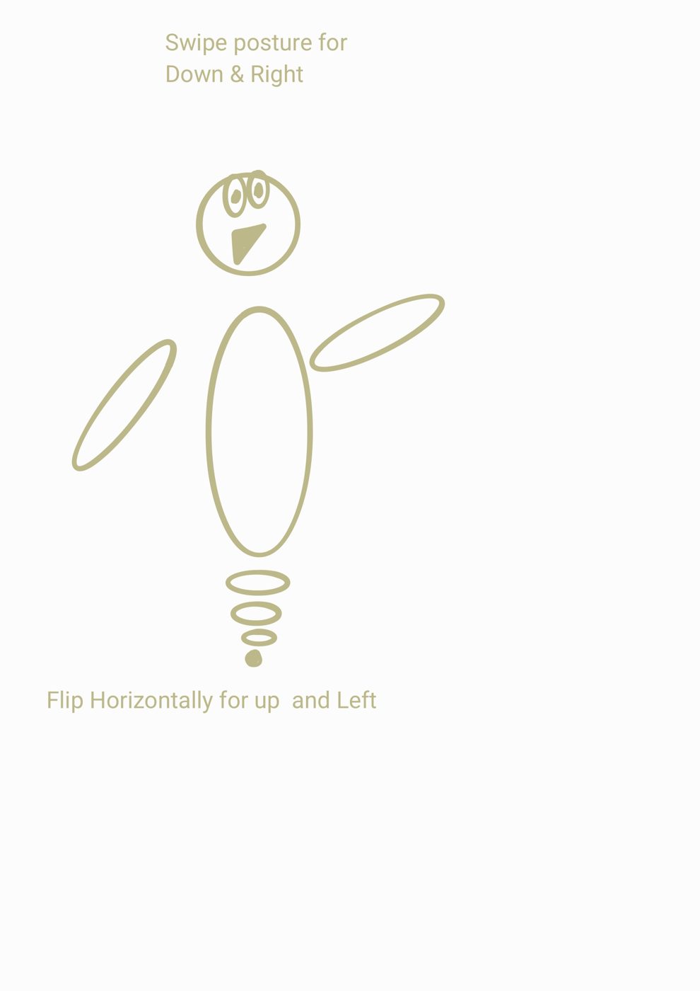
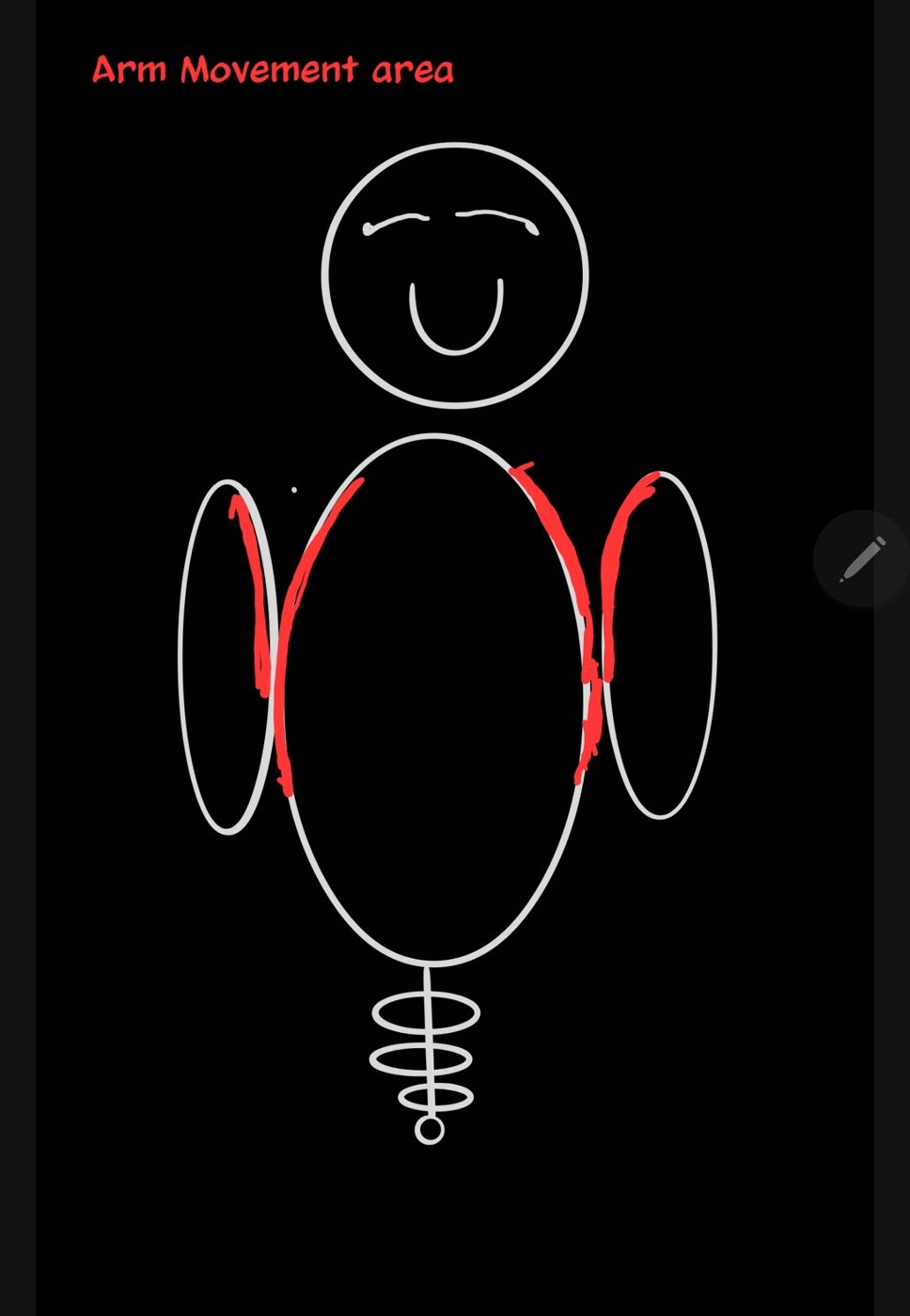
Rather than draw a separate helper pose for every direction, I designed one posture and reused it — flipped and rotated to cover up, down, left, and right. It's a minor call, but it's the kind of constraint-driven thinking that keeps an indie product maintainable: fewer assets, consistent character, faster iteration.
A guide for a wary audience has to feel friendly, calm, and never condescending. The first pass was a generic glossy chat-bubble figure — fine, but cold. I iterated by hand toward a warmer, simpler character with clear, readable expressions, and even storyboarded functional states like a "thinking" pose where the eyes track to double as a loading indicator.

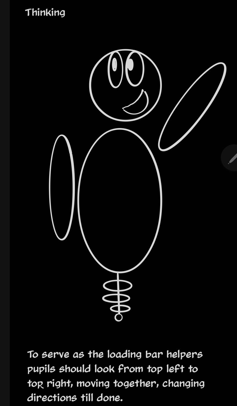
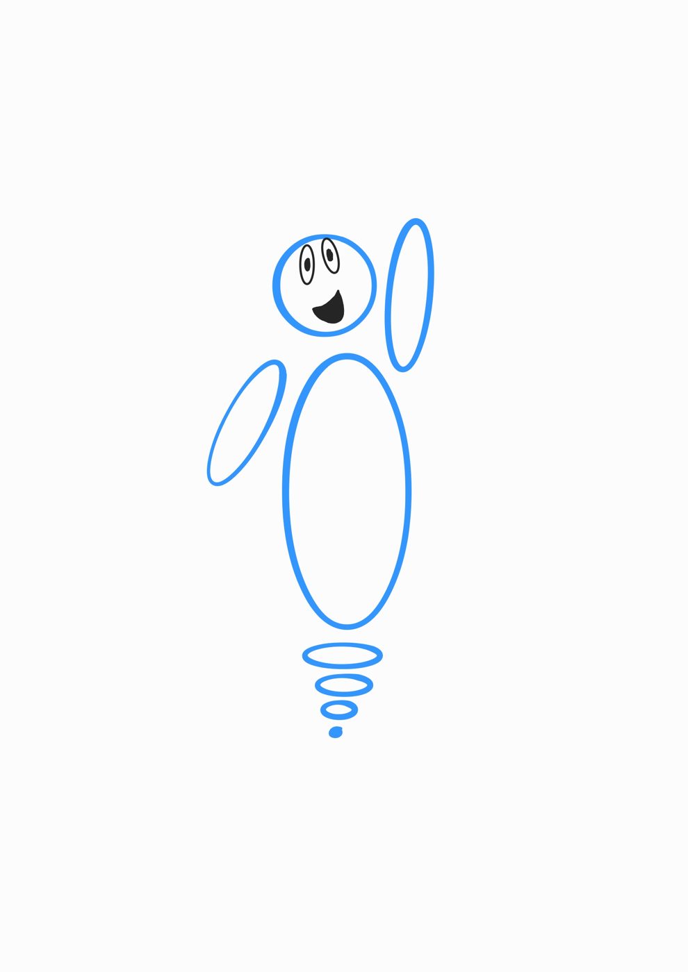
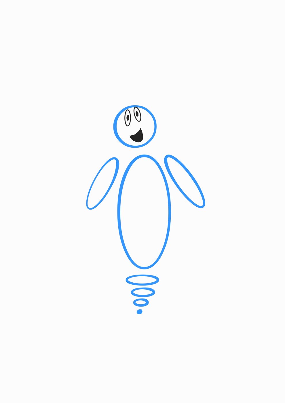
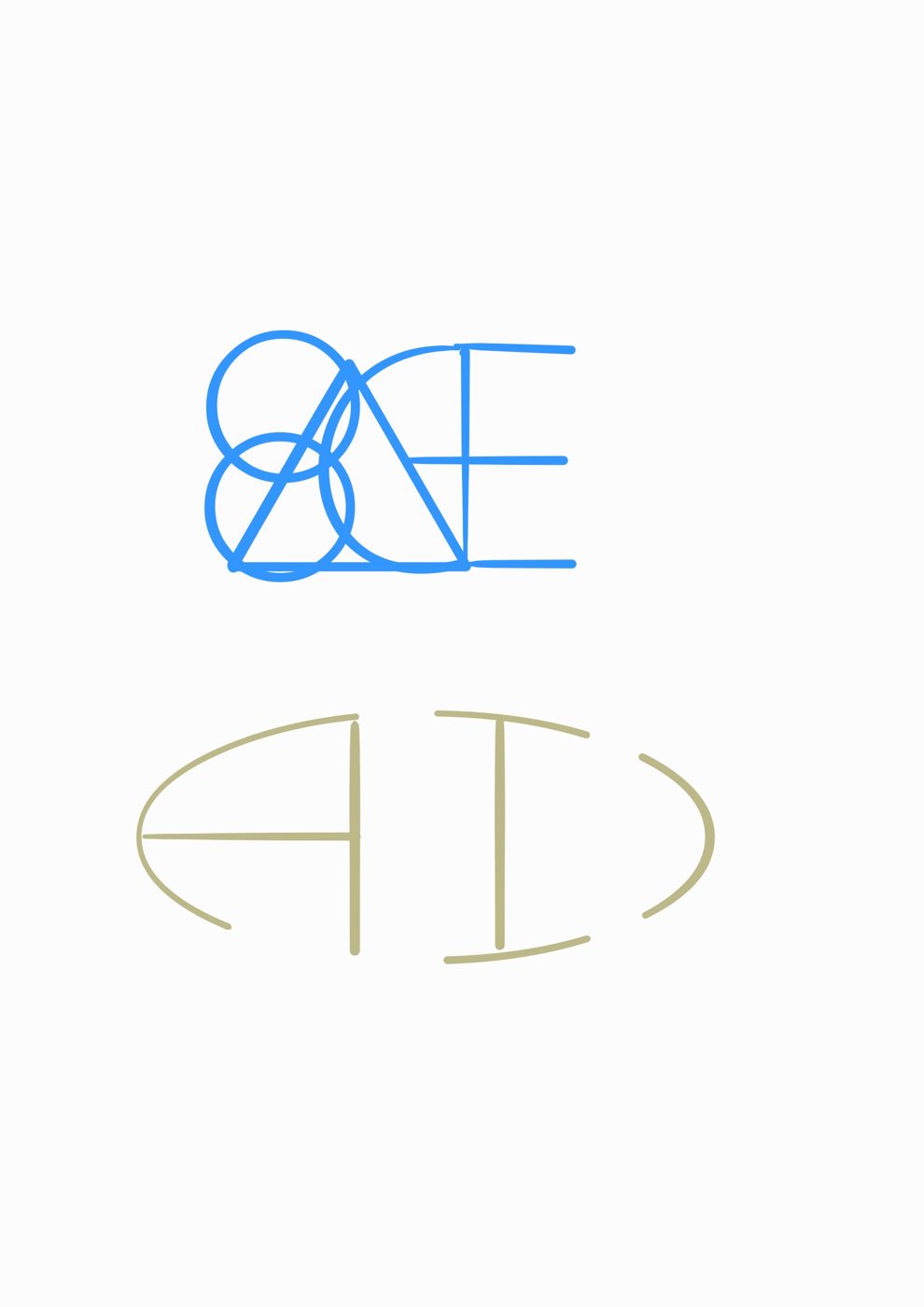
The brand direction moved alongside the character. Early naming explored "SAGE," which evolved into ADIN — and I worked the wordmark by hand, testing overlapping-circle letterforms and a cleaner monogram before settling on the final identity.
The fix had two parts, both aimed at that first fragile moment:
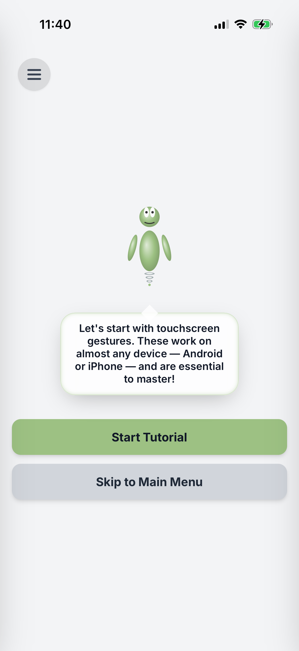
Before the main screen, ADIN now explains what the app is, why it exists, and how to use it — so no one lands on a blank interface guessing. Orientation comes first, features second.
When someone pauses too long, the helper steps in with a gentle nudge toward the next action — catching hesitation exactly where it happens instead of leaving people stranded.
The framing shifted from "an app" to a patient tutor sitting beside you — which set the right expectation for the guided, low-pressure experience inside.
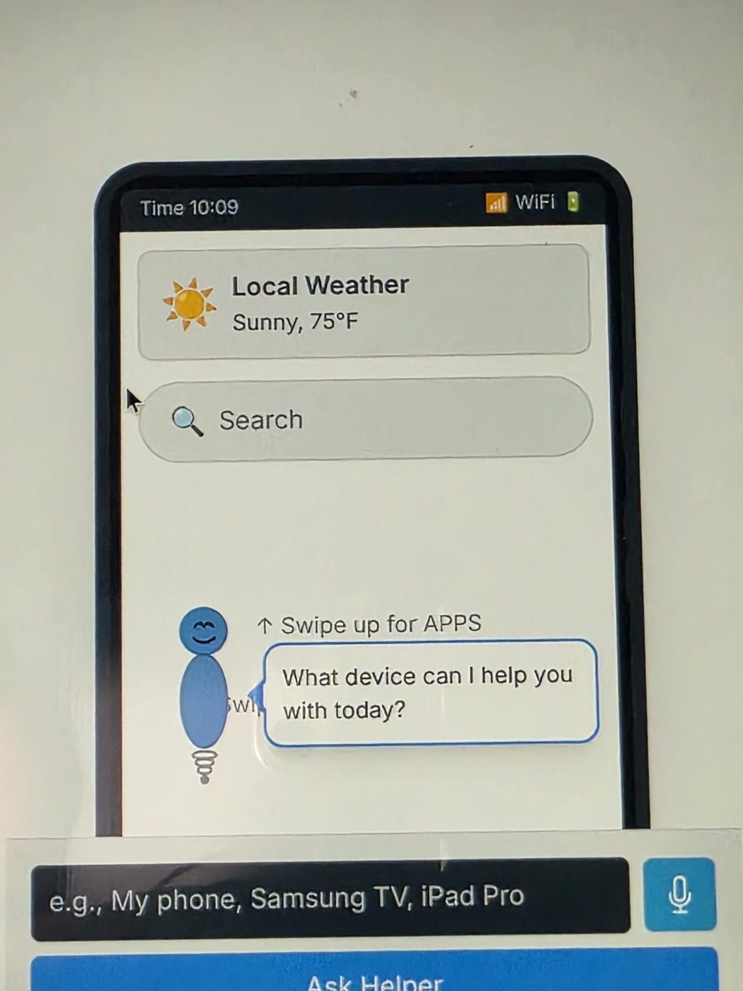
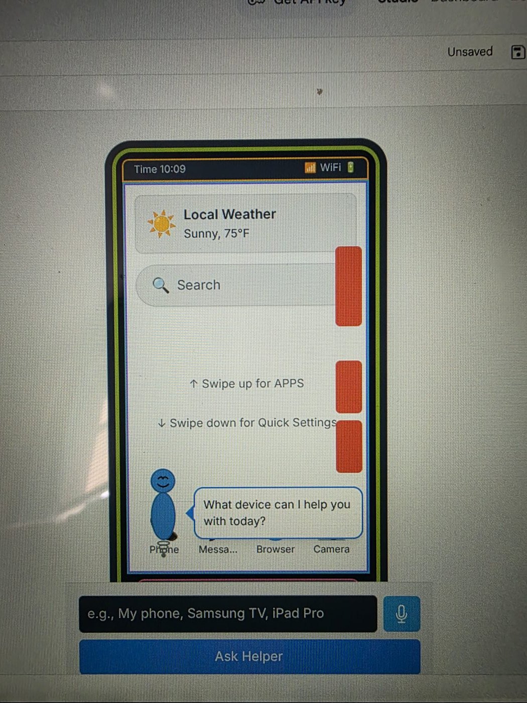
I ran two rounds of usability testing with older-adult participants, using the first to surface the orientation problem and the second to validate the redesign. The second study — conducted after the welcome tutorial and inactivity prompts shipped — showed the change working: participants retained more of what they learned and navigated their devices more confidently than before the redesign. The orientation problem was no longer stopping them at the door.
Just as important, the studies changed how ADIN communicates: clearer language, a calmer pace, and prompts that arrive when they're needed. ADIN has since iterated to version 38, each release shaped by what real users actually did — not what I assumed they would.
The biggest lesson: for this audience, the first ten seconds are the whole product. A feature no one reaches doesn't exist. Next, I want to grow the test group beyond four participants and instrument in-app behavior so qualitative findings can be backed by usage data.
I came into the certificate as a developer who knew his interfaces weren't as good as his code. I came out with a shipped, user-tested product and a framework for knowing why any screen does or doesn't work. The certificate was the beginning of the story, not the end — the two sections that follow are what happened after graduation.
ADIN started as an Android app. In 2026 I ported it to iOS and shipped it to the App Store — my first time on a Mac, in Xcode, or through Apple's review process. Because ADIN is a Capacitor-wrapped web app, the design, the practice phone, the character, and the whole research-driven interaction model carried straight over. The screens below are running on iPhone.
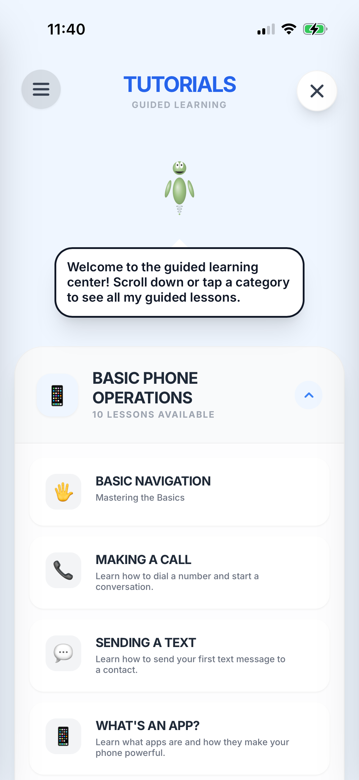
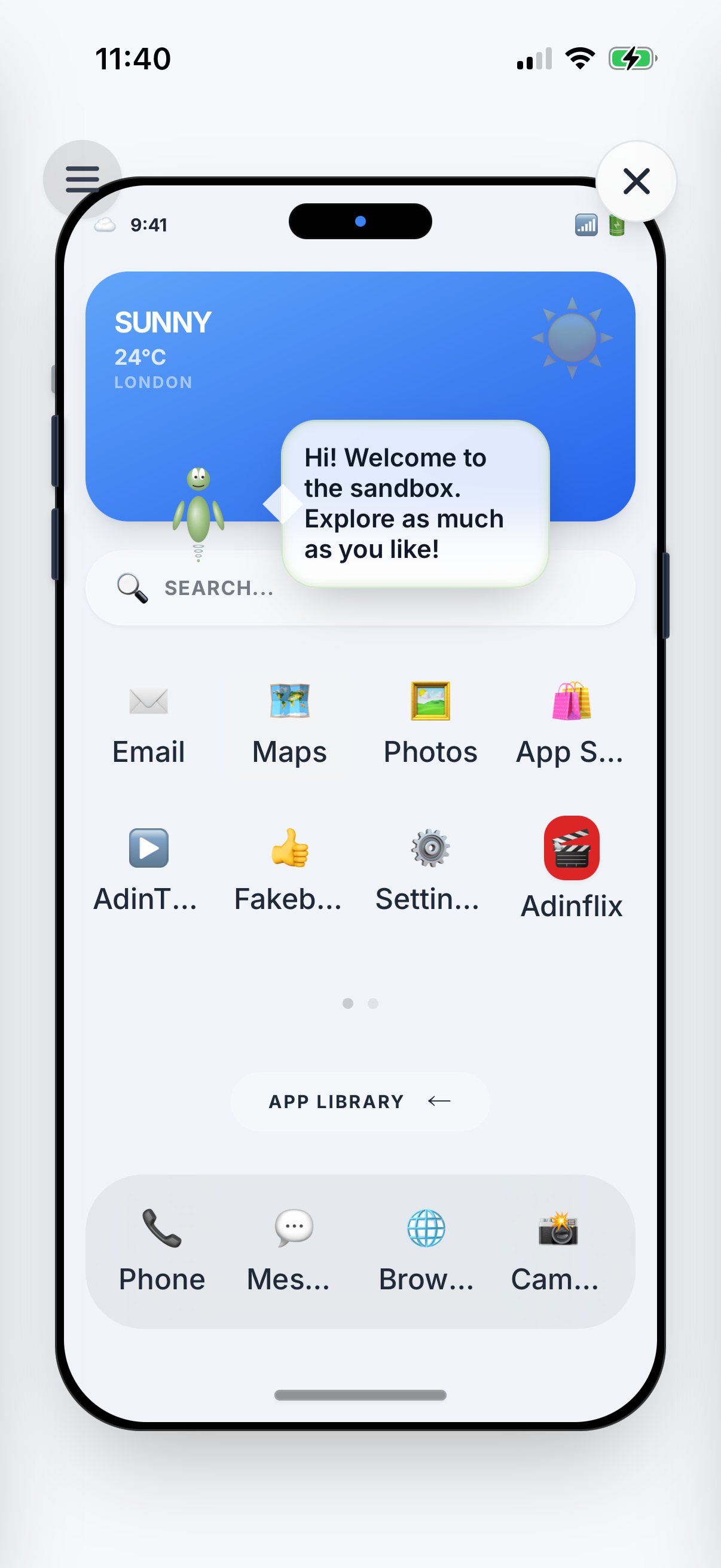
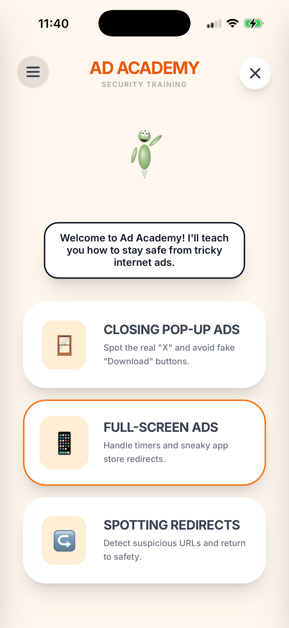
A UX case study usually stops at "and then it shipped." This is the part that doesn't make the portfolio: the native configuration, the backend hardening, and three App Store rejection cycles it took to turn a working Android app into an approved iOS one. I keep it here because knowing how something ships is as much a part of the craft as knowing how it's designed.
On Android, Gemini calls originally ran client-side. Before the iOS port I moved them to a
server-side Cloud Run backend (adin-server) with the API key locked in Secret
Manager — so no key ships inside the app, on either platform.
Added Firebase App Check so only genuine app instances can reach the backend: reCAPTCHA v3
on web, Play Integrity on Android, and DeviceCheck on iOS, with the backend verifying every
token via firebase-admin. The correct Play Integrity SHA-256 came from Google Play
Console's App Signing page — not the local keystore.
Upgraded Capacitor from v6 to v8 (Kotlin 2.1.0, Java 21, minSdk 24), then did the iOS-only
work: CocoaPods setup, every required Info.plist privacy permission (camera, photo
library, microphone, speech recognition), AdMob iOS initialization, and Firebase / App Check
wiring in AppDelegate.
Apple flagged Android-specific references. Resolved with updated screenshots and a measured push-back — dropped by the next review round.
The Support URL in App Store Connect was returning an error. Fixed by pointing it at a real,
publicly reachable anchor: ceymer-studios.com/#contact.
The real one. Apple wanted an in-app prompt before the first AI query — not just a privacy policy link. Added a one-time consent dialog that explains, in plain language for older adults, exactly what gets sent to Google Gemini and that no personal information is collected. It blocks the first request until the user agrees, and never appears again.
The iOS port broke the Mac and Xcode seal for the whole studio — the same Capacitor + App Check + App Store pattern went on to carry my other apps onto iOS. ADIN was the one I learned it on. That's the part I'm bringing to whatever I build next.
 Ceymer Studios